How might a social media platform that is designed for discovering new topics be explored through a 360° navigation system?
Modern day social media sucks its users into a never-ending rabbithole of echo chambers through its algorithms, pushing content its users already agree with and limiting their exposure to new ideas and perspectives.
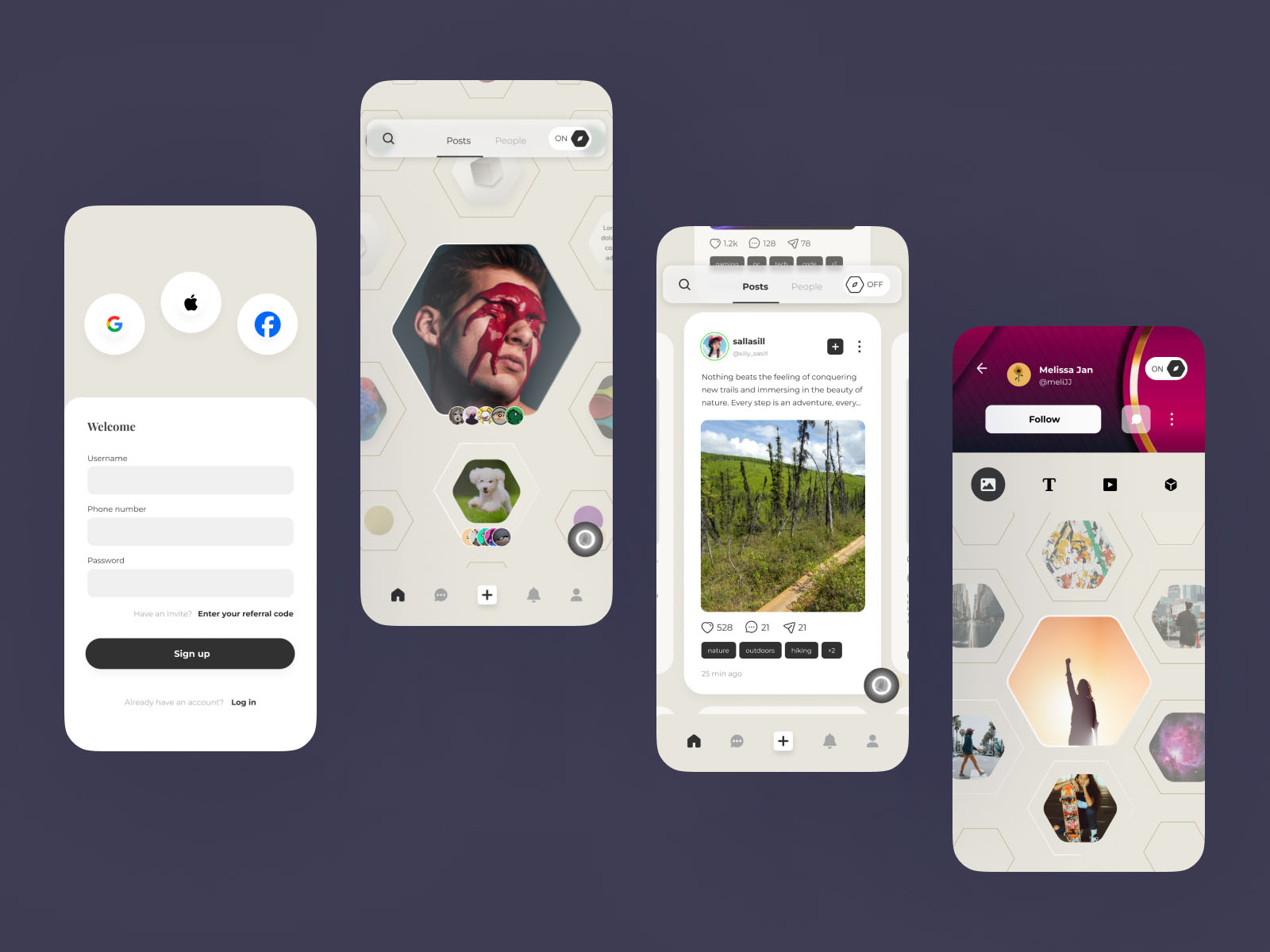
Menace is a social media platform that aims to break this cycle by providing users with a 360° navigation system that allows them to explore new topics and ideas in a more immersive and engaging way. The concept of incorporating a 360° navigation system reflects the idea of breaking free from the constraints of traditional social media, where users are limited to a linear feed of content that easily traps them into the cycle of doomscrolling.
The current social media landscape is fragmented and isolating, with users often stuck in echo chambers that limit their exposure to new ideas and perspectives. This can lead to a lack of understanding and empathy between different groups of people, as well as a lack of engagement with new topics and ideas.
Menace aims to address these issues by providing users with a 360° navigation system that allows them to explore new topics and ideas in a more immersive and engaging way. This system provides users with a more holistic view of the content available on the platform and provides additional avenues for exploration of new topics.
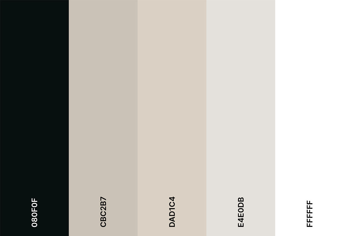
The aesthetic design of Menace must be intuitive, easy, and engaging to use while sticking to a neutral color palette of mostly black and white.
The sample websites provided by the client are highly interactive and filled with microinteractions. In short, they want to make the devs suffer.

Core theme: beehive pattern with 360° sandbox navigation
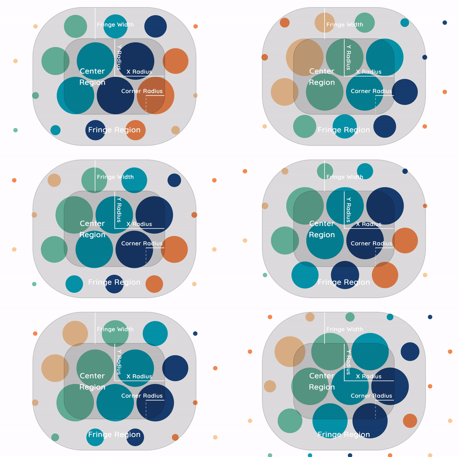
BubbleUI demonstration by Blake Sanie
I started my research with two competitors of Menace at the complete opposite ends of the spectrum: Instagram and Amo. From there, I moved on to researching the value proposition of Menace and how it could differentiate itself from the competition. Most of the reseaerch lies within the intersection between business and user experience: Most of my research focuses on the intersection of business and user experience. Everything converges to this one question: how might we we design a product that guides users to actions aligning with our business goals while effectively communicating our value proposition?
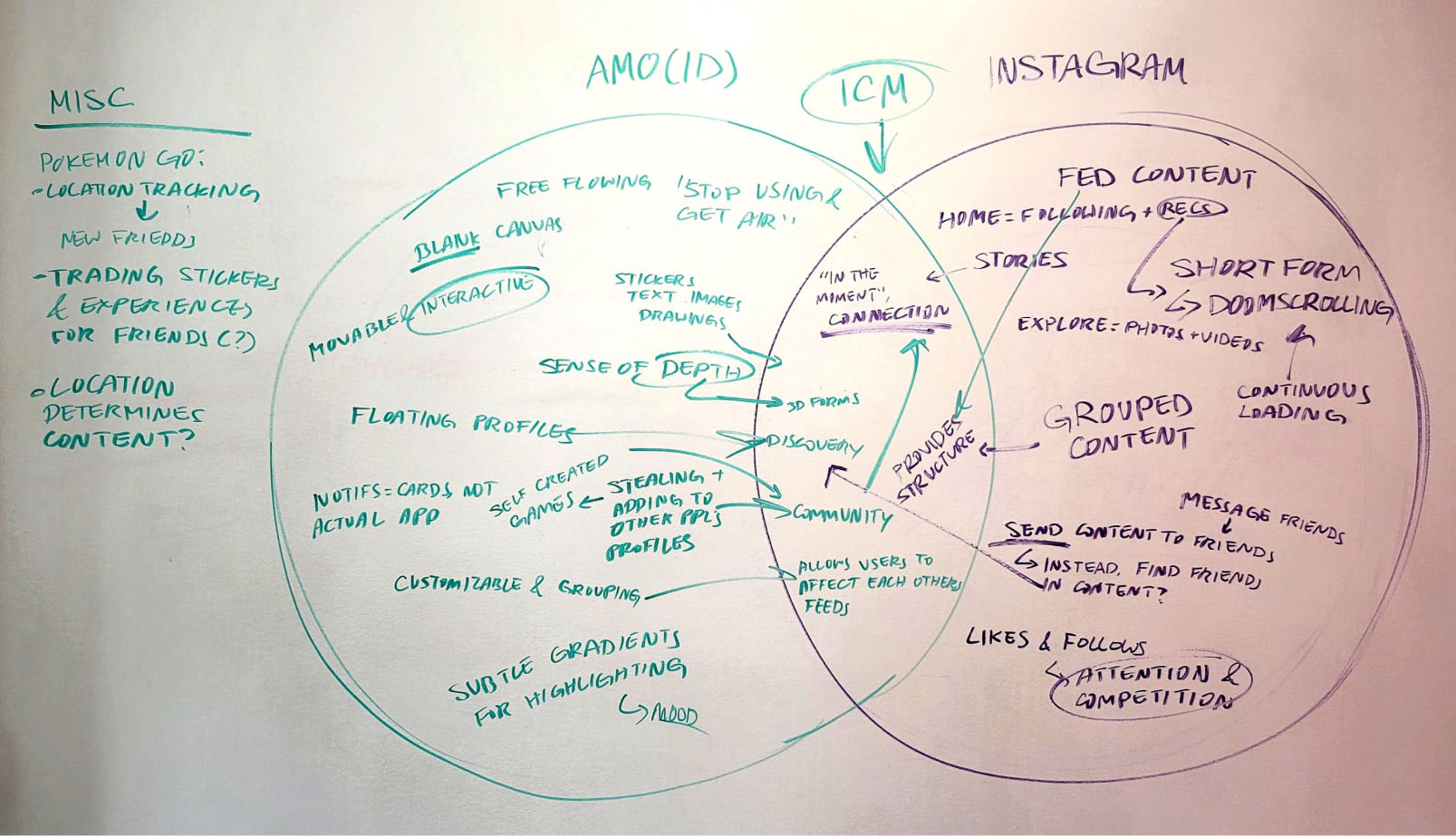
Amo and Instagram stand at opposite ends of the spectrum. Instagram is a very traditional social media platform, following the expected norms of social media. Amo is a small app that leans heavily into the sandbox experience—users can explore freely with no constraints, but it lacks structure. It starts off as a blank canvas, and users have to build up their own “homepage” from scratch.
Menace aims to strike a balance between these two extremes. It aims to provide the structure Instagram has while allowing users to explore freely with the 360° navigation system like Amo.
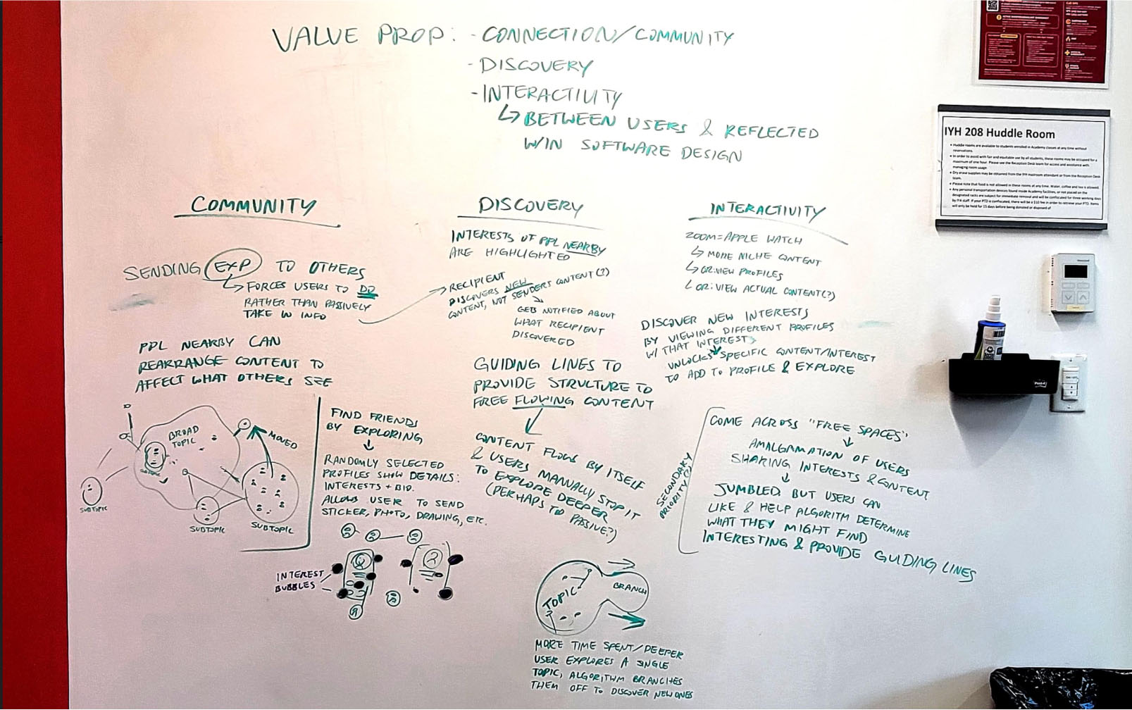
Based off of observations of the comparison between Amo and Instagram as well as the problem Menace aims to solve, I came up with 3 key value propositions to focus on for Menace: community, discovery, and interactivity.
From there, I started brainstorming different individual features that reflect these values, such as users being able to affect each other’s feeds, being pushed the interests of people geographically close to them, and being able to collect different topics like trophies. I let this guide my design decisions moving forward, especially when it came to figuring out the user flow.
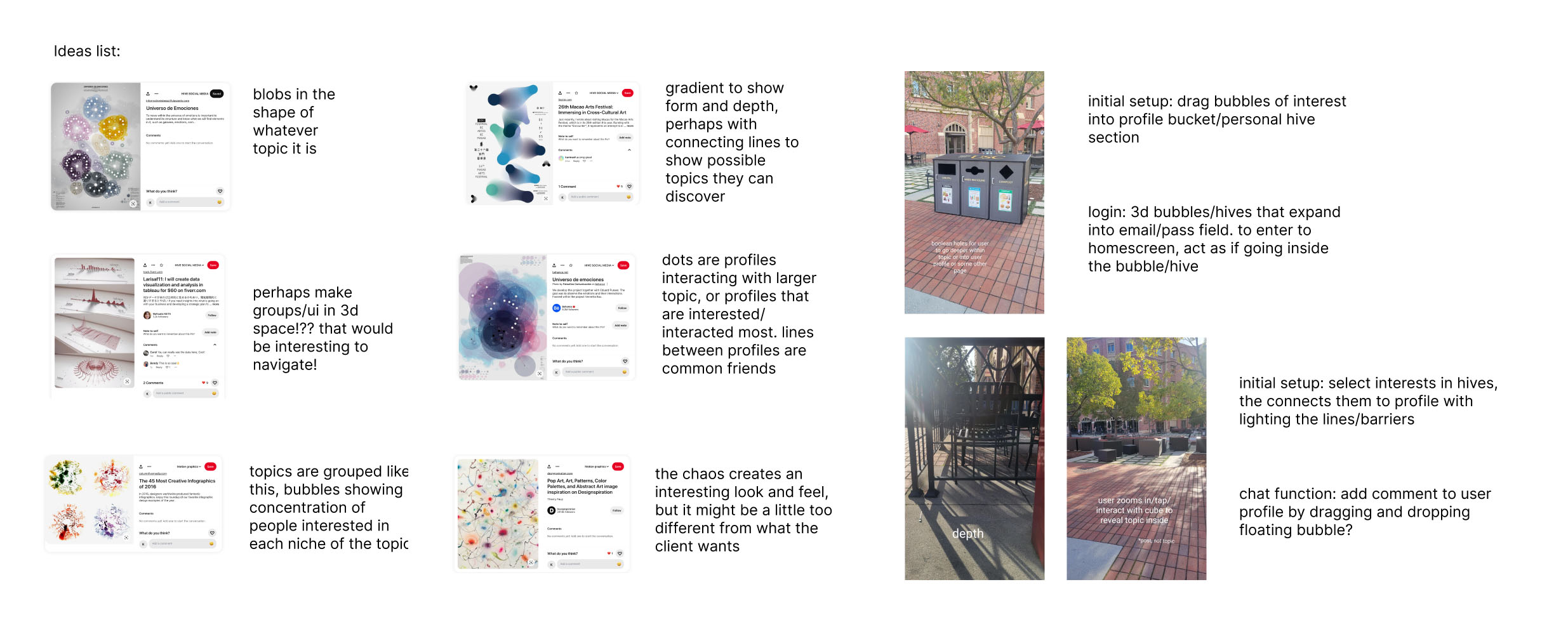
The most critical portion of the design process and by far what I spent the most of my time on is figuring out how the navigation system would work. I started off with crazy ideas, not worrying about feasibility or usability. This allows my brain to think outside the box and come up with ideas that I wouldn’t have thought of otherwise. From there on, I slowly fleshed out what I liked, what worked, and what didn’t, and iterated on that.
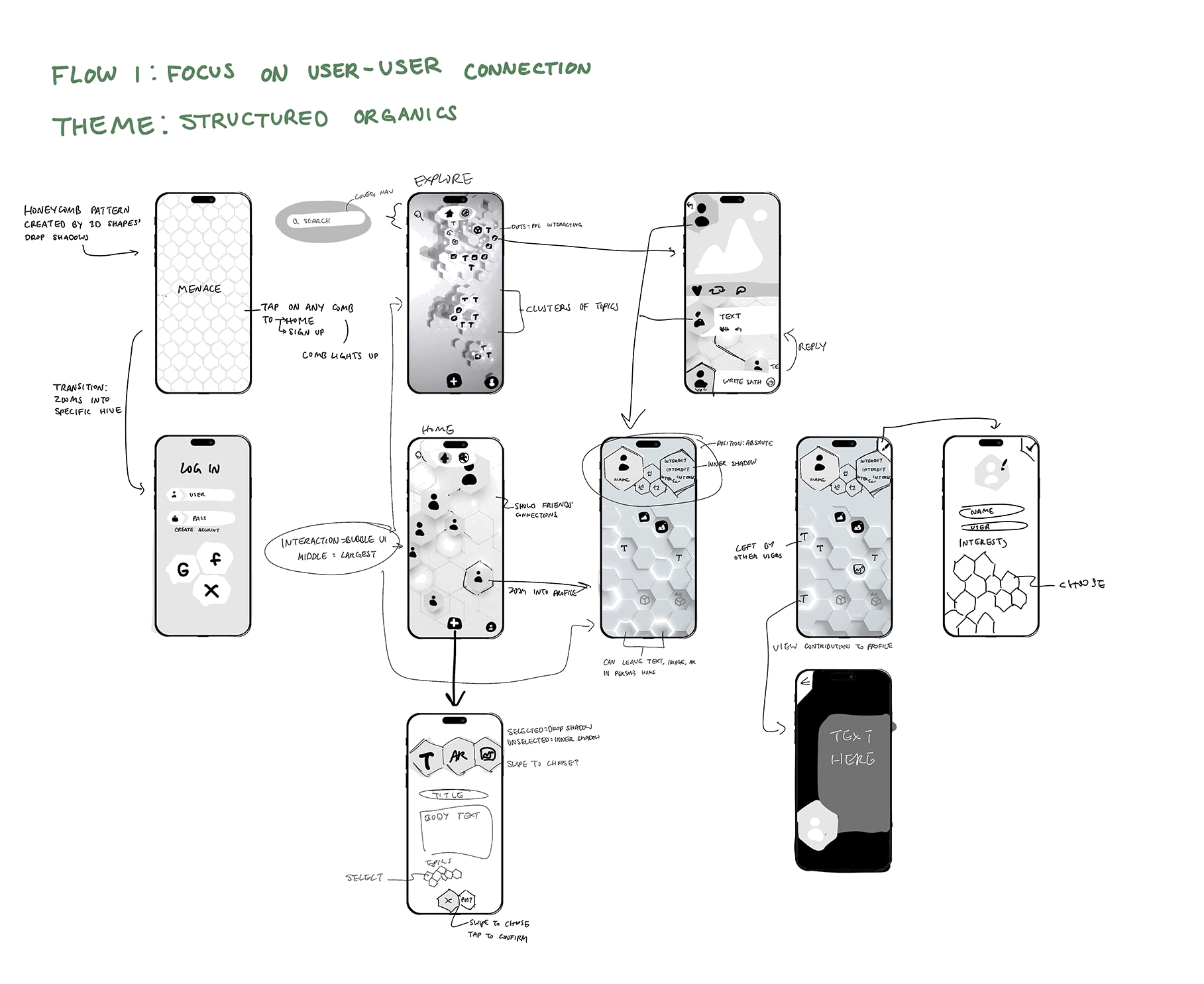
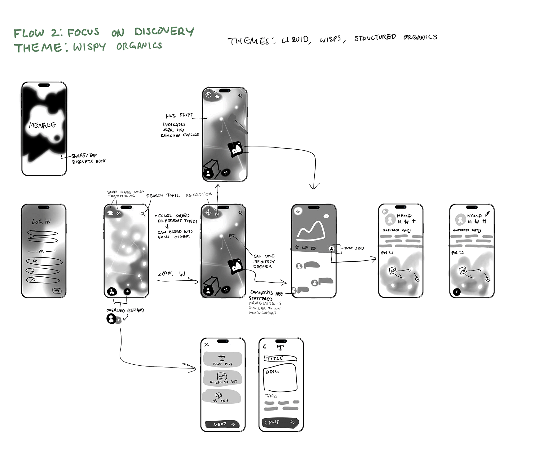
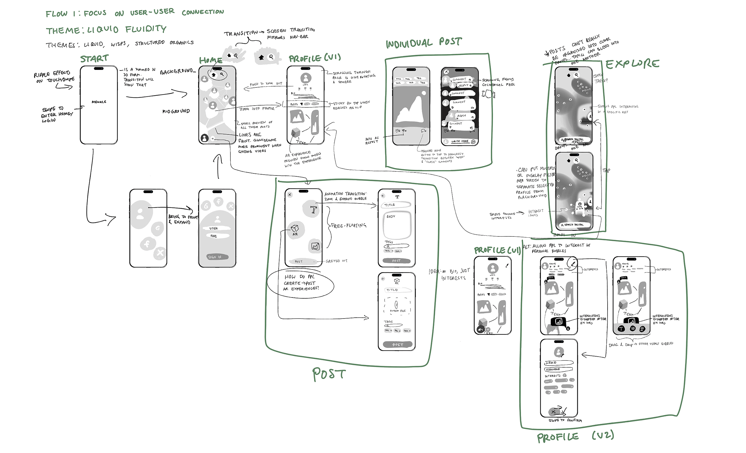
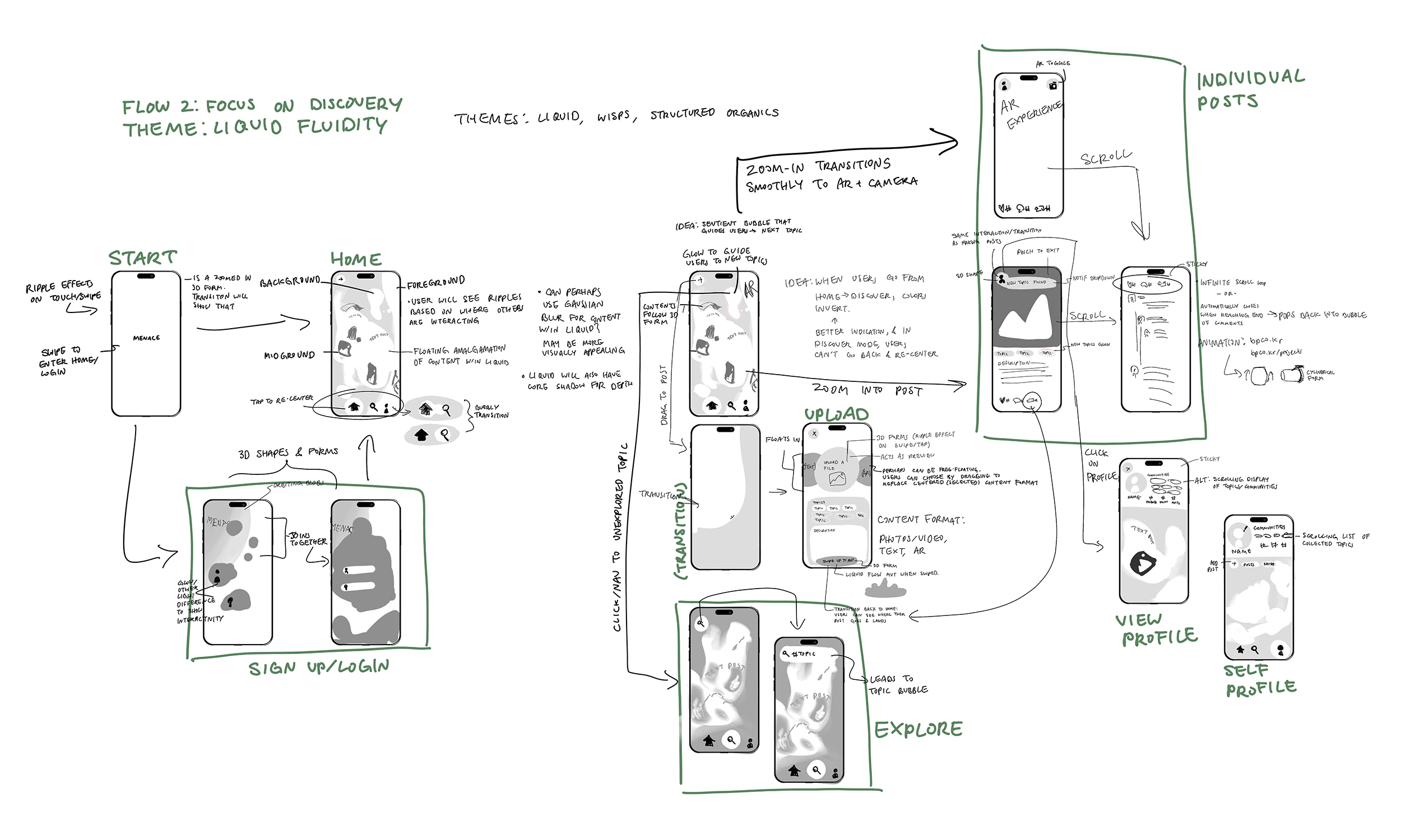
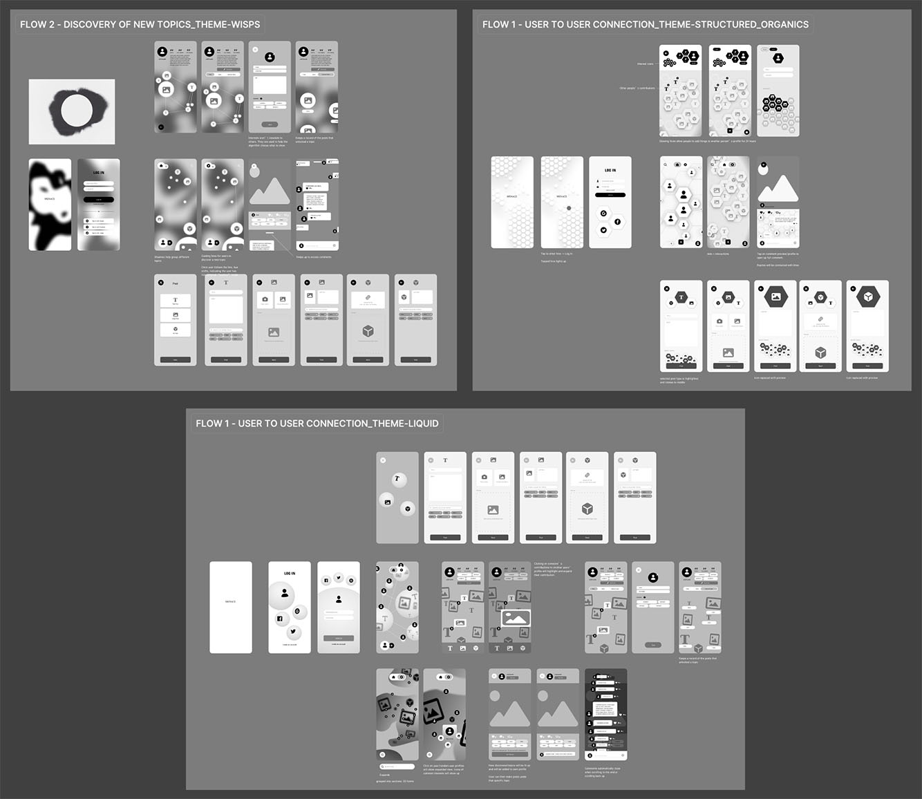
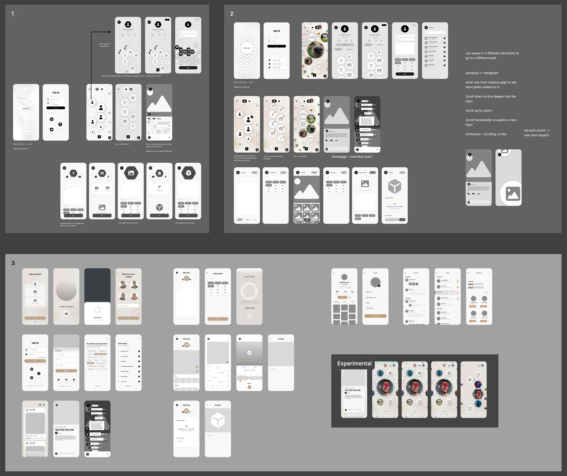
By far the greatest challenge in this project was making everything intuitive. I had a lot of interesting ideas working with 3D space that I really wanted to incorporate and make a reality, but I needed to prioritize ease of use and comprehension. Ultimately, I reluctantly decided to adopt a more conventional 2D design. I realized that forcing users to work with a 3D space would be a huge barrier. People are used to 2D interfaces, and anything that takes more than a few seconds to figure out and get used to is a huge turnoff. Good design is invisible. It should be intuitive and easy to use, and the user should never have to think about it.

I ended up simplifying my 3D honeycomb idea that I really loved to prioritize usability
Another challenge I faced was providing structure to a freeform system. I wanted to give users the freedom to explore and discover new topics, but I also needed to provide some framework to enhance usability. Without this, it’ll be easy for users to experience a sense of confusion and uncertainty, and any degree of uncertainty is a barrier to engagement. It is easy to fall into the same “trap” as Amo, where users are given too much freedom and are left to figure everything out on their own. I experimented with glows, guiding lines, manipulating opacity, playing around with size, shape, and more to figure out how to guide users and provide that structure without being too intrusive. Over many days of experimentation, I finally found a balance that I was happy with, using size as the main indicator of heirarchy.
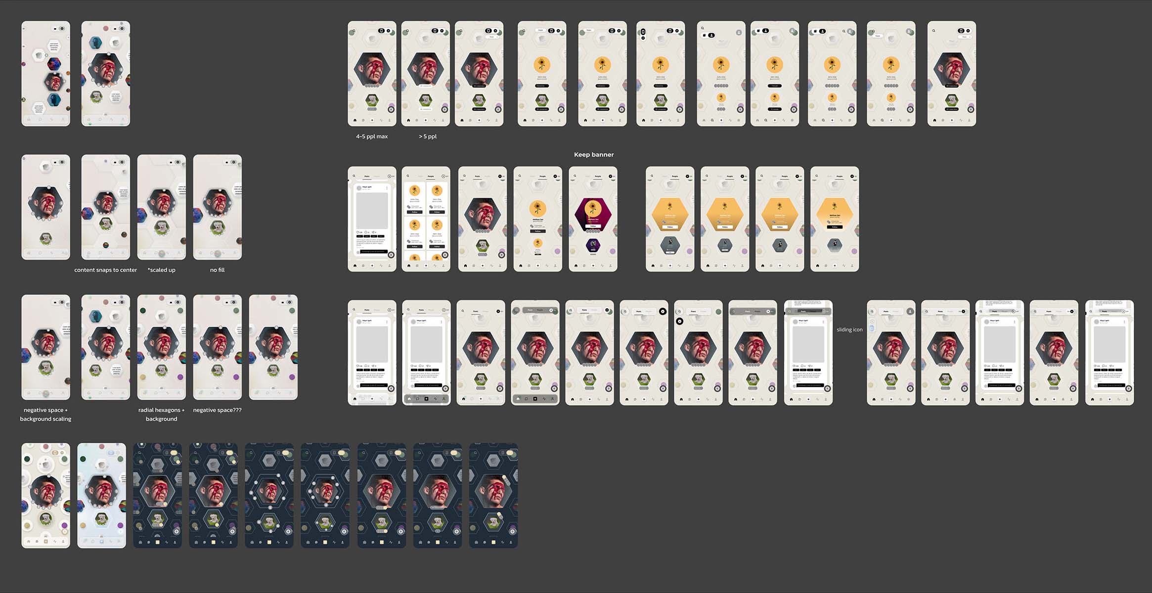
All the iterations I did for a single screen exploring 360° navigation
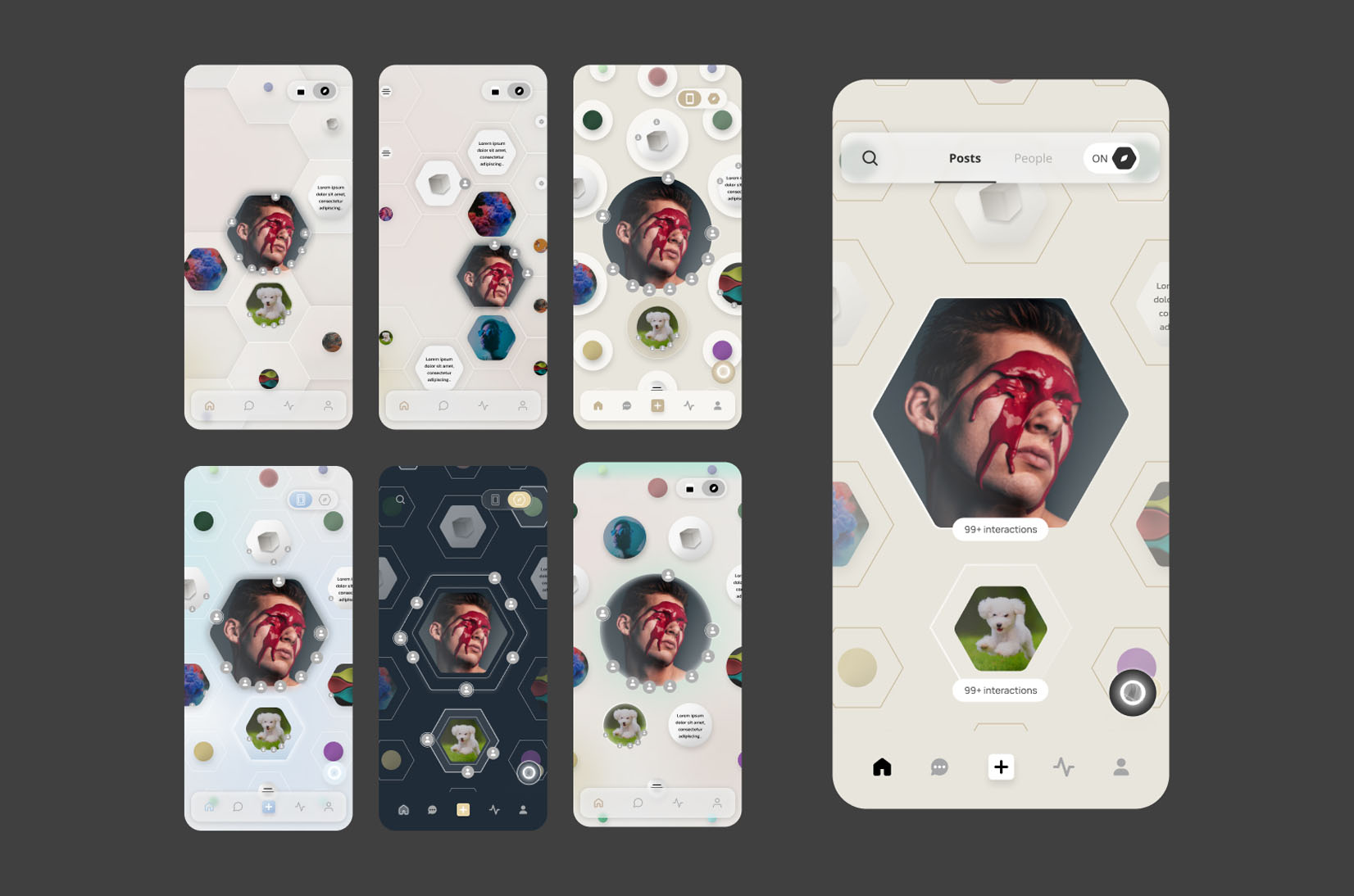
Screens of some design explorations—designing indicators for reccommended content, post popularity, and overall navigation. I ended up settling on the right-most screen
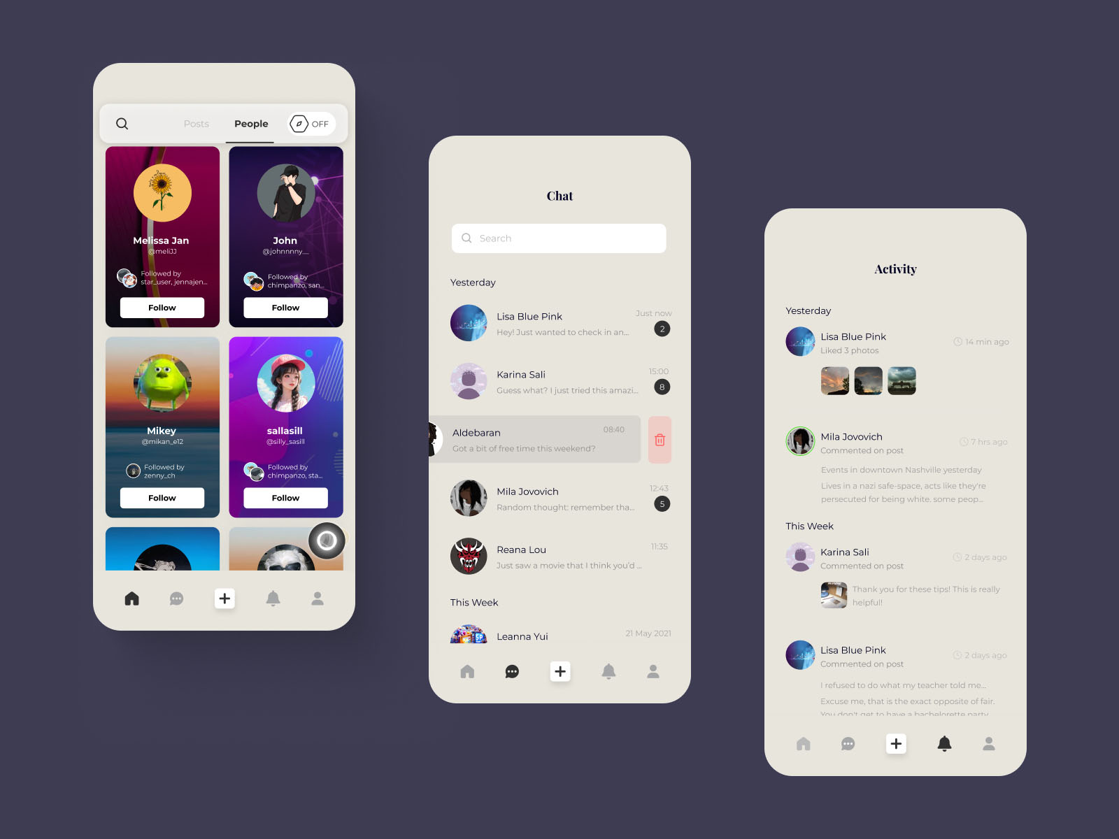
Good design is invisible. Like my biggest qualm with 3D space, a 360° navigation system can also be quite foreign to a lot of people. I addressed this problem by designing another view mode—one where people can view posts in a more traditional rectangular grid. This way, users can still use the platform even if they’re not comfortable with the 360° navigation system. This also meant that I had to figure out how to toggle between the two views. At this point, the client has also requested a feature to find friends in 360° space. While it’s simple enough to tweak the existing system to accommodate this, just adding on these two additional features can easily clutter the interface if not handled carefully. This seemingly minor addition ended up adding a whole new nav bar to the page, and it had the home screen go through a redesign.
Clients are not designers, and as a designer, I know to take elements of their moodboard with a grain of salt sometimes. In this case, it was their color palette. They had wanted something purely black and white with a few shades of a neutral bone color if necessary. I knew that this would be too boring and monotonous, but I did need to respect my client’s wishes. I designed 2 variations that aligned with their vision, and then I went as far as my imagination would take me with the other variations. It is my job to explore what otherwise may not have even been considered if something isn’t working.
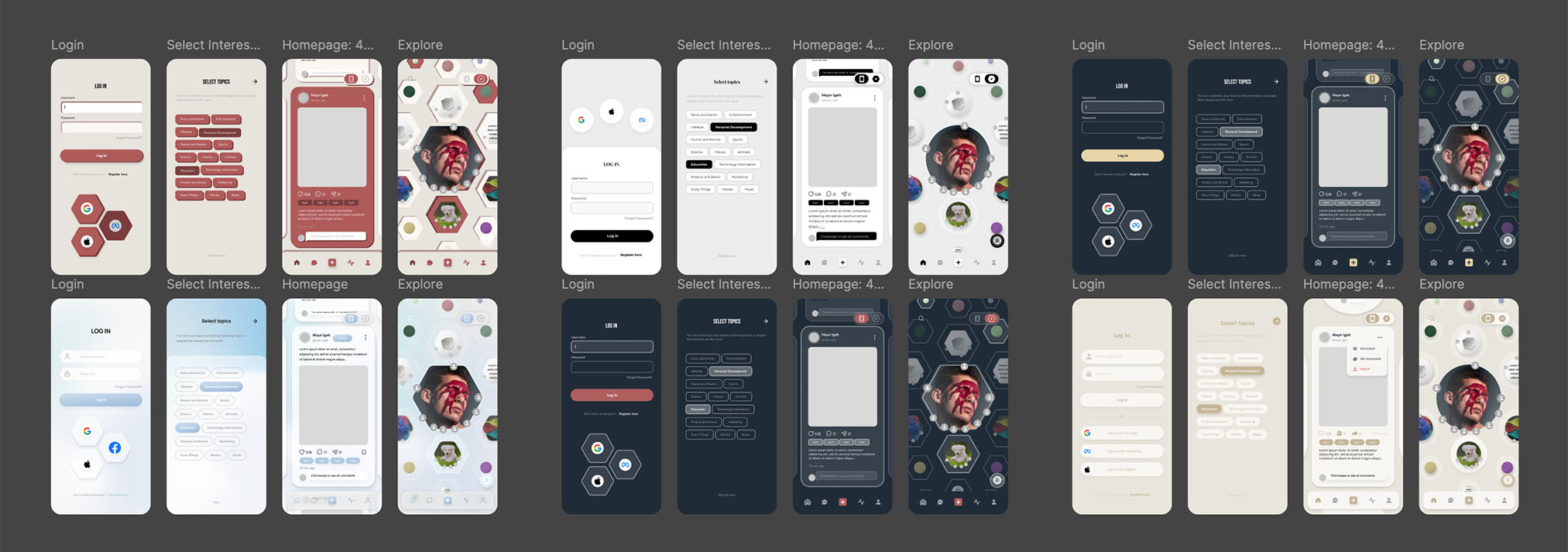
The color explorations I did even if it didn’t match the provided moodboard
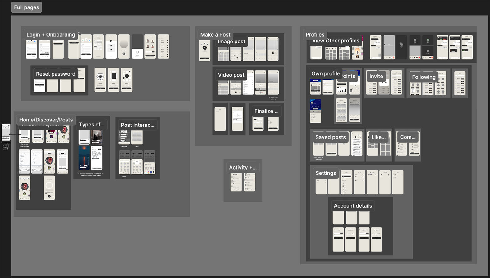
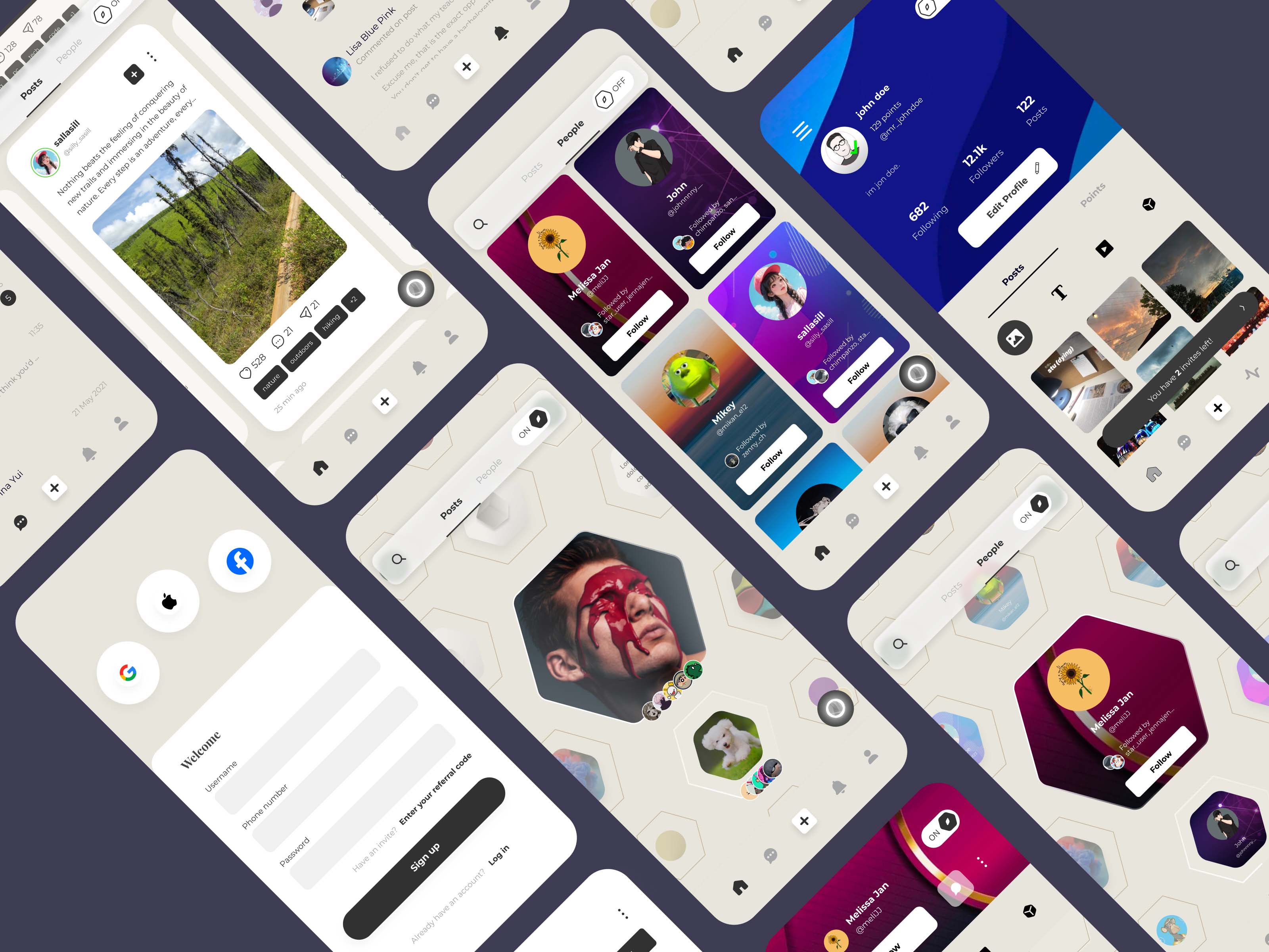
The final version I handed off to the devs
People on social media who want to experiment with unique platforms
Playfair Display Bold
ABCDEFGHIJKLMNOPQRSTUVWXYZ
abcdefghijklmnopqrstuvwxyz
1234567890
Montserrat
ABCDEFGHIJKLMNOPQRSTUVWXYZ
abcdefghijklmnopqrstuvwxyz
1234567890
Montserrat Bold
ABCDEFGHIJKLMNOPQRSTUVWXYZ
abcdefghijklmnopqrstuvwxyz
1234567890
#313131
#A5A6A7
#E8E5DC
#F0F0F0
#FFFFFF
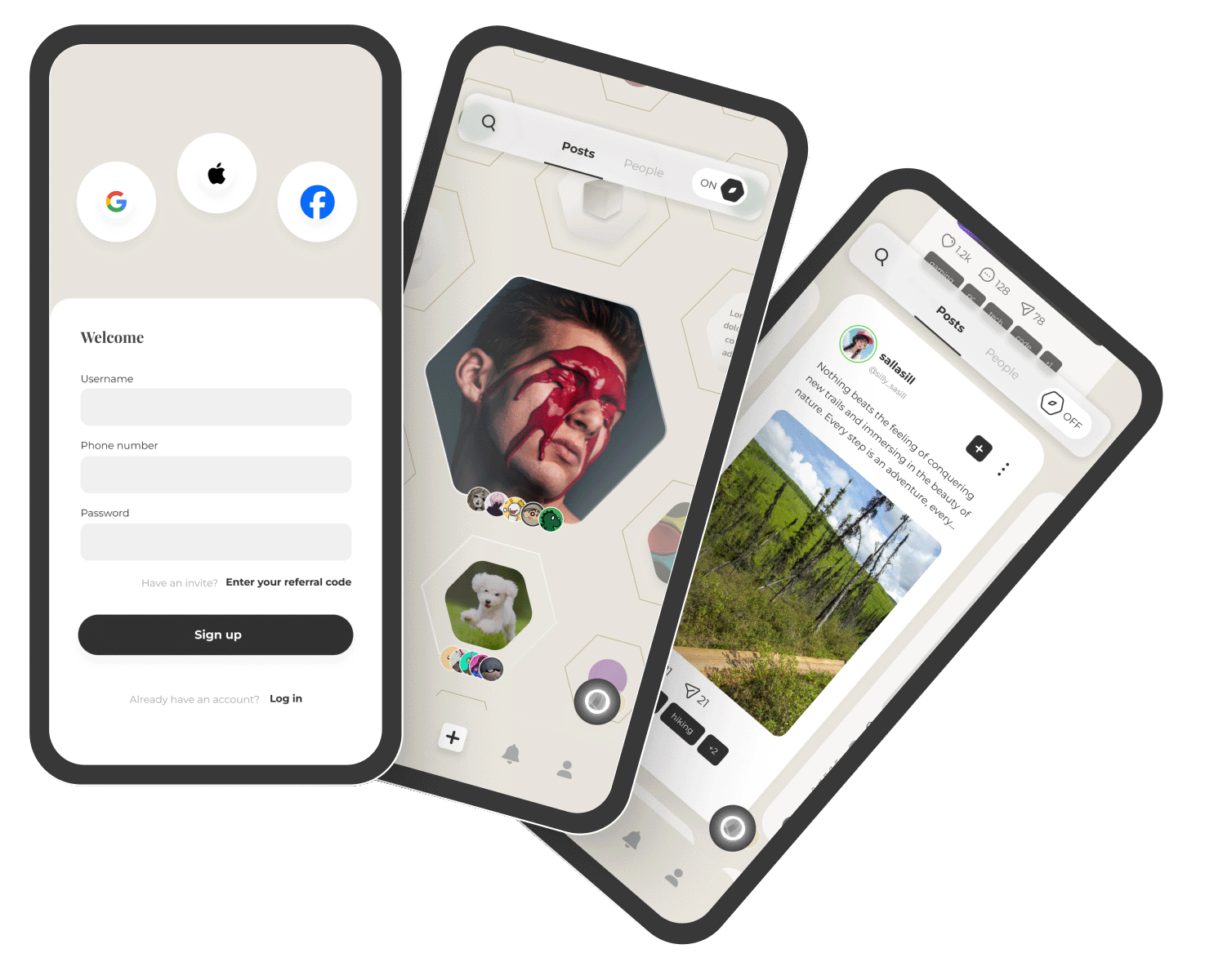
Testing, testing, testing
The most important next step by far is to conduct user testing. With something so unconventional, it’s important to get feedback from real users to see what works and what doesn’t. People will always find a way to break your system, and it’s important to catch these issues before they become a problem. I would also like to conduct A/B testing to see how different design decisions affect not just user engagement, but also how users engage with the platform. This will help me understand what design decisions are most effective in guiding users to actions that align with our goals. Without thorough testing, it’s impossible to know if users will embrace the 360° navigation system or prefer the traditional grid view.
Iteration
Based on user feedback, iterative improvements to the design will be made. Given the nature of this project, multiple iterations are necessary to achieve the desired outcome. User feedback will also guide business decisions, which may evolve as the project progresses. Business goals inform design decisions, so it’s important to keep an open mind and be willing to make changes as necessary.
Accessibility
Good design is accessible. The platform should be usable by as many people as possible, regardless of their abilities. Conducting thorough accessibility audits and making necessary adjustments will ensure that the platform is usable by everyone. This includes considerations for color blindness, screen readers, and other accessibility features.